Funny T-Shirt Design Ideas for Programmers & Developers
Here’s the honest truth about most “funny programmer t-shirt” design lists on the internet.
They’re written by people who Googled “programming jokes,” skimmed the top ten results, and then wrote them down with “print this on a shirt” energy. The jokes are technically adjacent to coding. The designs are conceptually vague. And any developer who reads them can immediately tell they were assembled from the outside looking in.
This list is not that.
These are 100+ funny t-shirt design ideas for programmers that are technically accurate, culturally specific, and, most importantly, actually funny to the people who write code for a living. They’re organized by category so you can find the right design for the right developer, the right niche, and the right context. Whether you’re a developer building your own wardrobe, a print-on-demand creator looking for fresh concepts, a designer working on programmer apparel, or someone trying to find the perfect custom shirt idea for a gift, this is the resource.
We’ll cover the concept, the visual treatment that works best, and why each design lands with developers. Because a great funny t-shirt idea isn’t just the joke, it’s knowing how to present it so it hits the way it’s supposed to.
Let’s get into it.
What Makes a Funny Programmer T-Shirt Design Actually Work
Before the ideas, the framework. Because understanding why certain designs land is more valuable than any individual concept, it lets you evaluate new ideas, refine existing ones, and build on the foundation rather than just copying what already exists.
Technical Accuracy Is Non-Negotiable
Developer humor has a zero-tolerance policy for being almost right. A shirt that says if (coffee == null) { panic(); } works because it’s syntactically valid. A shirt that writes the same idea with slightly wrong syntax gets noticed immediately and for the wrong reasons. Developers are detail-oriented by profession, they will catch a missing semicolon on a t-shirt faster than most people proofread a text message.
Every single design idea in this list has been checked for technical accuracy. That’s not a bonus feature, it’s the minimum bar.
Shared Experience Over Shared Knowledge
The best funny programmer t-shirts don’t just require technical knowledge to appreciate; they require shared experience. There’s a difference between a joke that a developer understands and a joke that makes a developer feel seen. “Hello, World!” is something every developer understands. “99 bugs in the code, fix one, now there are 127” is something every developer has lived. The second category produces the best shirts.
Visual Treatment Is Half the Joke
A great concept delivered badly is a missed opportunity. The visual presentation, typography choice, layout, color, format, is doing half the work on any text-based programmer shirt. Monospace fonts for code references. Clean sans-serif for typographic statements. Syntax highlighting colors when it adds meaning. The visual language of coding itself is a design system, using it correctly makes the joke land harder.
Specificity Creates Connection
A generic coding joke is fine. A joke about a specific language, framework, tool, or experience creates an immediate personal connection with the developer wearing it or receiving it. “Programmers” is a broad audience. “Python developers who hate writing boilerplate” is a specific one. The more specific the design, the stronger the connection, even if it reaches fewer people.
The 100+ Funny T-Shirt Design Ideas – Organized by Category
Category 1: Classic Coding Humor – The Timeless Greats
These are the designs that have stood the test of time because they capture universal developer experiences. Every generation of developers rediscovers them and finds themselves in them.
Debugging and Bug Humor
Design #1: “It’s Not a Bug, It’s a Feature” Visual treatment: Bold sans-serif, centered, dark background. Add a small asterisk with fine print: “(This feature is undocumented and may cause data loss)” for the extended version. The straight version works as pure typographic statement. The extended version rewards close reading. Why it lands: Universal developer defense mechanism. Every developer has used this phrase and meant it at least partially.
Design #2: “99 Little Bugs in the Code” Visual treatment: Render it as a song verse, the full lyric structure, in a slightly worn serif font that references the “99 Bottles of Beer” source material. The song format is immediately recognizable and the subversion of the expected ending makes it funnier than the straight version. Why it lands: The recursive nature of bug-fixing is one of the most universally painful developer experiences. This design validates that pain with humor.
Design #3: “Debugging: Removing Bugs. Programming: Adding Them.” Visual treatment: Two-line typographic treatment, each line in a different weight. “Debugging” in light weight, “Programming” in bold, the visual contrast reinforces the joke. Why it lands: Beautifully logical and self-aware. The implication that all programming is just pre-debugging is darkly accurate.
Design #4: The Rubber Duck Debug Protocol Visual treatment: A minimal line-art rubber duck with a pseudo-technical label, “Official Debugging Unit v1.0” with fake spec data: Error Detection Rate: 94%, Power Source: Confusion, Interface: One-sided conversation. Clean technical diagram aesthetic. Why it lands: Rubber duck debugging is beloved developer lore, explaining code to an inanimate duck to find the bug yourself. It sounds absurd and works remarkably well.
Design #5: “It Compiles. Ship It.” Visual treatment: Bold, single line, large type. Ideally in a compile-success green on dark background. No explanation needed. Maximum confidence. Zero actual QA evidence. Why it lands: The exact energy of every developer who has ever pushed a build ten minutes before a deadline.
Design #6: Stages of Debugging Flowchart Visual treatment: A fake flowchart starting at “Code not working” that eventually leads to either “It works! Don’t touch it.” or “Have you tried turning it off and on again?” with every intermediate step being a variation of “Google the error message.” Why it lands: Procedurally accurate in a way that is also completely ridiculous and entirely true.
Design #7: “It Works on My Machine” Visual treatment: Either the classic bold typographic version, or better formatted as an official-looking certification badge: “CERTIFIED: Works on Developer’s Local Machine. Results may vary in production, staging, QA, and the real world.” Why it lands: The single most universally understood phrase in software development. The certification badge treatment elevates it from a text joke to a proper design.
Design #8: “Have You Tried Googling It?” Visual treatment: Clean sans-serif, slightly smaller second line with a fake “Senior Developer Advice Card” border, making it look like official senior dev wisdom dispensed from a helpdesk. Why it lands: Simultaneously self-deprecating and accurate, a significant percentage of programming is knowing how to search for the answer, not knowing the answer.
Deployment and DevOps Humor
Design #9: “Deploy on Friday” Dumpster Fire Visual treatment: A detailed line illustration of a dumpster with flames, labeled “PRODUCTION – Friday 4:58 PM.” Below it: “This is fine.” in the classic internet meme font. The dumpster fire is doing the heavy lifting visually. Why it lands: The single most universally agreed-upon bad idea in software development. The “This is fine” reference makes it a layered cultural reference.
Design #10: “I Test in Production” Visual treatment: Bold, declarative, no apology. White type on black. Alternatively: render it as a fake safety warning label, “WARNING: This developer tests in production. Approach with caution during business hours.” Why it lands: Controversial enough to be funny, honest enough to be relatable, and technically defensible enough that some developers wear it with genuine pride.
Design #11: git commit -m "Fixed everything" Visual treatment: Pure monospace code font. Dark background. Single line. The contrast between the confident commit message and the complete absence of detail about what was actually fixed is the joke, and the monospace treatment sells the authenticity. Why it lands: Every developer has written this commit message. Every developer is slightly ashamed of it. Seeing it on a shirt is a shared absolution.
Design #12: “Merge Conflict Survivor” Visual treatment: Military-style badge or patch design, circular, with an illustration of two branches dramatically colliding, surrounded by the text “MERGE CONFLICT SURVIVOR” and a fake year (the year should be recent enough to feel personal). Why it lands: Merge conflicts are universally dreaded — the feeling of opening a file and seeing red and green diffs everywhere is immediately recognized by every developer who uses version control.
Design #13: “Breaking Prod Since [Year]” Visual treatment: Vintage-style design, like a company founding date plaque. Slightly distressed typography, fake establishment date. The irony of wearing a broken production incident as a badge of honor is the joke. Why it lands: Experience in development is partly measured in production incidents survived. This design turns that trauma into a resume line.
Design #14: CI/CD Pipeline Humor Visual treatment: A circular diagram showing: Write Code → Push → Build Fails → Fix Build → Tests Fail → Fix Tests → Deploy → Break Production → Emergency Hotfix → Write Code. The circular structure makes the trap explicit. Why it lands: The DevOps cycle, rendered honestly, is genuinely terrifying — and every DevOps engineer will see themselves in this loop.
Documentation and Comments Humor
Design #15: “Write Comments. Your Future Self Will Thank You.” (Said No Actual Developer Ever) Visual treatment: Two-part design, the inspirational statement in a motivational poster font, then the ironic qualifier in a much smaller, sadder font below it. Why it lands: The gap between good documentation intentions and developer reality is eternal and universally relatable.
Design #16: A Comment Block That Says “// I have no idea why this works. Don’t touch it.” Visual treatment: Code block aesthetic, dark background, comment syntax color (grey or green), monospace font. Formatted exactly as it would appear in an IDE. Why it lands: Every codebase has this comment somewhere. Every developer has written it. It’s the white flag of someone who found a working solution by accident.
Design #17: “Documentation Is Like a Love Letter to Your Future Self (That You Never Write)” Visual treatment: Typographic, slightly melancholic tone. Works well in a serif font that contrasts with the self-aware humor of the content. Why it lands: The failure to document code is a near-universal developer sin. This design acknowledges it with the exact right level of resignation.
Category 2: Programming Language War T-Shirt Design Ideas
Language wars are eternal. They are also one of the richest seams of developer humor because the tribalism is real, the preferences are deeply felt, and the jokes work because both sides simultaneously understand and laugh at their own positions.
Python Design Ideas
Design #18: import antigravity, and Let It Speak for Itself Visual treatment: Minimal. Just the import statement in Python syntax, monospace, on a dark background. No explanation. If you know, you know. (Running import antigravity in Python actually opens a browser to an xkcd comic. It’s a real Easter egg.) Why it lands: Maximum insider credibility. Only people who’ve actually explored Python’s standard library will fully appreciate it.
Design #19: “Python: Because Life’s Too Short for Semicolons” Visual treatment: Clean, confident sans-serif. The Python logo integrated subtly, not as a large graphic element but as a small reference. The statement stands alone. Why it lands: Python developers are quietly smug about their language’s readability. This is their flag.
Design #20: Significant Whitespace Joke Visual treatment: A block of Python code where the humor is in the indentation itself, perhaps a nested structure that reveals a message when you read the indentation levels. The joke is built into the format. Why it lands: Python’s mandatory indentation is simultaneously one of its most praised and most polarizing features. Making the indentation itself do comedic work is meta and clever.
Design #21: “There Should Be One, and Preferably Only One, Obvious Way to Do It” Visual treatment: The Zen of Python, rendered as a motivational poster. Pure typographic, slightly ironic given how many ways Python actually lets you do things. Why it lands: Python developers know the Zen of Python. Rendering one of its core tenets as a t-shirt is an in-group signal.
JavaScript Design Ideas
Design #22: typeof null === 'object' – True. This Is True. Visual treatment: Code block. Monospace. The statement on one line, with a commented annotation: // Don't ask. Just accept it. The comment does the emotional work. Why it lands: This is one of the most famous JavaScript quirks, null is technically of type “object,” which makes no sense and cannot be changed because too much of the web depends on the bug being there.
Design #23: “JavaScript: The Only Language Where NaN !== NaN is True” Visual treatment: Mathematical proof aesthetic, serif font, slightly formal layout, as if this is a peer-reviewed finding rather than a language design decision from the 1990s. Why it lands: NaN !== NaN is technically correct in IEEE 754 floating-point arithmetic, but experiencing it for the first time in JavaScript is genuinely destabilizing.
Design #24: JavaScript Framework Family Tree Visual treatment: An actual family tree diagram that starts with Vanilla JS at the top and branches into an increasingly chaotic structure of frameworks, meta-frameworks, and frameworks built on frameworks. The tree should look like it’s collapsing under its own weight by the bottom. Why it lands: The JavaScript ecosystem’s relationship with framework proliferation is legendary. Every frontend developer has navigated this tree.
Design #25: === vs == The War That Never Ends Visual treatment: Two-column battle poster aesthetic. Left side: == with the label “Chaos Agent.” Right side: === with the label “Type Safety Enjoyer.” Middle: eternal flame. The poster format plays into the tribal energy. Why it lands: Type coercion in JavaScript is a genuine philosophical divide. '5' == 5 being true in JavaScript is either a feature or a crime depending on who you ask.
Design #26: “This. Is. JavaScript.” (Pointing at a Stack of Nested Callbacks) Visual treatment: A rendered block of callback hell, deeply nested functions, each callback inside the last, with a minimal arrow pointing to it and the label “This is fine.” Monospace, dark background, IDE color scheme. Why it lands: Callback hell is a rite of passage for JavaScript developers and the reason Promises and async/await exist.
Java Design Ideas
Design #27: AbstractSingletonProxyFactoryBean Visual treatment: Just the class name. Nothing else. In clean monospace on a dark background. No setup, no punchline. The class name is the joke. (This is a real Spring Framework class name.) Why it lands: Java’s reputation for verbose, ceremony-heavy naming is legendary. This actual class name from the Spring Framework is the perfect encapsulation of everything that makes Java developers both proud and exhausted.
Design #28: “Java Developer: I’ve Written More Boilerplate Than Actual Logic Today” Visual treatment: Resigned typographic statement. Works best in a slightly tired, slightly proud aesthetic, the developer who has built something enormous out of pure ceremony. Why it lands: Java verbosity is a shared experience. The ratio of boilerplate to actual logic in enterprise Java projects is genuinely remarkable.
Design #29: “Still Waiting for the JVM to Start” Visual treatment: Loading bar that’s at 3%, the visual joke carries the weight here. Optionally formatted as an actual JVM startup log with timestamps. Why it lands: JVM startup time is a running joke in the Java community. The loading bar treatment makes the familiar frustration visual.
Other Language Ideas
Design #30: Rust – “My Code Didn’t Compile But I’m a Better Person For It” Visual treatment: Slightly philosophical, slightly defeated. The Rust compiler is famously strict and educational, it won’t let you do unsafe things, but it will explain exactly why in detail. Why it lands: Rust developers have a deeply complicated relationship with the compiler. It’s the toughest teacher in programming languages and the most respected one.
Design #31: C++ – “I Manage My Own Memory (And My Own Trauma)” Visual treatment: Dual-column typographic layout, the technical claim on the left, the emotional consequence on the right. Clean, slightly clinical font. Why it lands: Manual memory management in C++ is both a superpower and a source of suffering. This design acknowledges both simultaneously.
Design #32: Go – “Simple. Fast. Opinionated. Just Like Me.” Visual treatment: Three short declarative lines, then the personal kicker. Clean, minimal, fitting for a language that prides itself on simplicity. Why it lands: Go developers love their language’s simplicity and are occasionally just as opinionated about it as the language itself is about code style.
Design #33: PHP – “PHP: It Works. Don’t Ask How.” Visual treatment: Honest, resigned, slightly defensive. PHP has an enormous legacy and a complicated reputation; this design acknowledges both without being cruel. Why it lands: PHP developers have heard every joke. This one is self-aware enough to be genuinely funny rather than mean-spirited.
Category 3: Frontend and CSS T-Shirt Design Ideas
CSS has earned its own category because the frustrations are specific, universal among web developers, and genuinely inexhaustible as comedy material.
Design #34: “CSS: Cascading Style Sheets or Causing Severe Suffering?” Visual treatment: Two definitions, formatted like a dictionary entry. The first definition: the official one. The second: the experiential one. Serif font, dictionary layout. Why it lands: The gap between CSS’s elegant conceptual model and the reality of making it do what you want is a daily experience for every frontend developer.
Design #35: Center a Div Survival Certificate Visual treatment: An official-looking certificate of achievement, ornate border, official seal, fancy script, certifying that the bearer has successfully centered a div in CSS. The formal format contrasted with the mundane achievement is the joke. Why it lands: Centering elements in CSS has historically been far harder than it has any right to be. Every frontend developer has the scars.
Design #36: The CSS Specificity Wars Diagram Visual treatment: A battle scene illustrated entirely in CSS selector notation, !important as a nuclear weapon, inline styles as cavalry, IDs as artillery. The specificity hierarchy rendered as military strategy. Why it lands: CSS specificity conflicts are a genuine source of suffering for frontend developers. Rendering the abstract rules as a war is both accurate and cathartic.
Design #37: “Position: Absolute. My Sanity: Relative.” Visual treatment: Two lines, each formatted as a CSS property-value pair in monospace. The parallel structure between CSS positioning syntax and the emotional state is the joke. Why it lands: CSS positioning, particularly the interaction between absolute and relative positioning, is one of the most disorienting parts of frontend development.
Design #38: “It Looks Fine on Chrome” Visual treatment: Bold, confident on the front. On the back or in fine print: “Safari disagrees.” The specificity of Safari as the problem browser is important, it’s accurate, and frontend developers will immediately recognize the cross-browser testing frustration. Why it lands: Cross-browser compatibility issues are the bane of frontend development. Safari’s divergence from other browsers is legendary.
Design #39: Flexbox Victory Lap Design Visual treatment: Triumphant poster aesthetic, bold typography, maybe a trophy or medal graphic, celebrating having finally, truly, completely understood flexbox. The over-the-top victory celebration for understanding a CSS layout system is the joke. Why it lands: Flexbox is genuinely powerful but has a learning curve that breaks people. Understanding it completely is a real milestone.
Design #40: “Z-Index: 9999” – The Developer’s Last Hope Visual treatment: Monospace, single line, presented as a gravestone or monument inscription, like a developer’s final solution preserved for posterity. Why it lands: Setting z-index: 9999 when nothing else works is a universal frontend developer experience. It’s the digital equivalent of turning it off and on again.
Category 4: Data Science, ML, and Database T-Shirt Design Ideas
Data people have specific humor. The jokes are about messy data, overconfident models, and the eternal gap between what the stakeholder asked for and what the data actually shows.
Design #41: “In God We Trust. All Others Must Bring Data.” Visual treatment: Formal, slightly austere typographic treatment. Works in a clean serif font — it reads as a genuine principle, which makes the implication that most people don’t bring data funnier. Why it lands: Data scientists spend a significant portion of their careers asking for evidence and not getting it. This design is a manifesto.
Design #42: Correlation ≠ Causation (The Illustrated Version) Visual treatment: A graph showing two obviously unrelated things with a high correlation, the classic ice cream sales vs. shark attacks example, or Nicolas Cage films vs. pool drownings. The absurdity of the correlation makes the statistical point viscerally. Why it lands: Misuse of correlation as proof of causation is a pet peeve of every data scientist. Illustrating it with an absurd example is more educational than any lecture.
Design #43: Machine Learning Training Loop Humor Visual treatment: A flowchart: Collect Data → Clean Data → Train Model → Model Overfits → Tune Hyperparameters → Still Overfits → Question Career Choices → Collect More Data. The loop structure with no exit condition is the joke. Why it lands: The machine learning development cycle is an exercise in iterative suffering that any ML engineer will immediately recognize.
Design #44: “SELECT * FROM problems WHERE solution IS NOT NULL” – Returns 0 Rows Visual treatment: SQL query block in monospace, with a results panel below showing 0 rows returned. The honest acknowledgment that the query for solutions comes up empty is the joke. Why it lands: SQL humor works because the syntax is so expressive, you can make a genuine emotional statement that’s also valid SQL. This one lands particularly hard at the end of a long sprint.
Design #45: “I Keep All My Dad Jokes in a Dad-A-Base” Visual treatment: Clean typographic statement. The nested pun, database / dad-a-base – works as text but can be elevated with a simple database cylinder icon with a small joke symbol inside. Why it lands: Perfect intersection of dad humor and database culture. TechGeeksApparel actually has this one, it’s a genuine hit in the database administrator community.
Design #46: “Data Scientist: Makes Decisions With 95% Confidence Intervals and 0% Certainty” Visual treatment: Statistical notation aesthetic, the kind of font and layout you’d see in a research paper, applied to a deeply self-aware statement about the limits of statistical decision-making. Why it lands: The gap between statistical confidence and actual certainty is a fundamental tension in data science. This design acknowledges it with appropriate irony.
Design #47: Pandas vs. Numpy Culture Wars Visual treatment: Battle poster format, Pandas on one side with its red panda mascot energy, NumPy on the other with its array-focused stoicism. The tribal framing of a genuine Python data science debate. Why it lands: Data scientists genuinely have opinions about when to use Pandas versus NumPy. It’s a lower-stakes language war, but it’s real.
Category 5: DevOps, Cloud, and Infrastructure T-Shirt Design Ideas
Infrastructure humor exists at the intersection of “everything could break at any moment” and “I have automated everything except my own anxiety.” It’s rich territory.
Design #48: “There Is No Cloud. It’s Just Someone Else’s Computer.” Visual treatment: Cloud icon with an arrow pointing to a server rack. Clean, minimal, educational in its demystification. The flat-design treatment makes it look like an official infographic, which makes the bluntness funnier. Why it lands: The most accurate reframing of cloud computing ever articulated. Every infrastructure engineer has said this at least once.
Design #49: “Works in Dev. Not in Prod. Nobody Knows Why.” Visual treatment: Three lines, three different font weights, building to the resigned acceptance of the final line. The progression from confident statement to complete epistemic surrender is the visual joke. Why it lands: Environment parity issues are a genuine source of suffering in DevOps. The honest acknowledgment that nobody actually knows why resonates.
Design #50: Kubernetes Complexity Diagram (Honest Version) Visual treatment: An intentionally overwhelming architecture diagram labeled “Minimal Kubernetes Setup”, dozens of components, arrows going everywhere, multiple clusters. The contrast between the word “minimal” and the visual chaos is the joke. Why it lands: Kubernetes has a reputation for complexity that the community acknowledges with self-aware humor. This design validates the feeling that “simple” Kubernetes setups are neither simple nor minimal.
Design #51: “On Call: Pray for Me” Visual treatment: Simple, slightly desperate typographic plea. Works as a phone notification aesthetic, like an on-call alert rendered as a shirt. Red background option for maximum urgency communication. Why it lands: Being on call is a specific and universally uncomfortable developer experience. The prayer framing acknowledges that technical skill only goes so far when production goes down at 3 AM.
Design #52: Terraform Plan Before / After Visual treatment: Two code blocks side by side, a small, neat Terraform plan on the left labeled “What I wrote,” and a massive, terrifying plan on the right labeled “What terraform plan showed me.” The scale difference is the joke. Why it lands: Infrastructure-as-code has a way of revealing unexpected scope. Any developer who has run terraform plan and been surprised by the result will recognize this immediately.
Category 6: Cybersecurity T-Shirt Design Ideas
Security culture has its own language, its own humor, and a particular fondness for designs that play on the line between protector and threat actor.
Design #53: “Ethical Hacker: I Break Things Professionally” Visual treatment: Business card aesthetic, clean, formal, the word “Ethical” doing significant moral weight lifting in front of “Hacker.” Why it lands: The formalization of breaking things as a legitimate profession is inherently funny. The business card format makes it look official, which is the joke.
Design #54: “I’m the Person Your Firewall Warned You About” Visual treatment: Bold, confident, no apology. Dark background, strong typography. This works particularly well as a women-in-tech cybersecurity design, confident and technically specific simultaneously. Why it lands: Cybersecurity professionals sit on the edge of the attacker/defender divide by design. This design leans into that positioning with appropriate swagger.
Design #55: Penetration Testing Business Card Shirt Visual treatment: Formatted as a professional business card on the shirt, with “Penetration Tester” as the job title, fake company name, and fake contact details. The contrast between the formal business card format and the job title is the joke. Why it lands: “Penetration tester” is a completely legitimate job title that sounds like it should require a more careful explanation at professional networking events.
Design #56: sudo !! – Because I Meant to Run That as Root Visual treatment: Monospace, single command, clean. The sudo !! command re-runs the previous command with sudo privileges, the shirt is for people who know exactly what that means and have done it in a panic. Why it lands: sudo !! is the command you run after a permission denied error, and it requires a certain level of Linux familiarity to appreciate. Pure insider credential.
Design #57: “My Password Is Incorrect” Visual treatment: Clean typographic statement that functions as both a joke and, technically, information security advice (your password literally is “incorrect” if you type it wrong). Works best as a minimal design on a dark shirt. Why it lands: Multi-layered joke — it’s funny as a literal statement, it’s funnier when you consider that “incorrect” is technically a valid password hint response, and it’s funniest to anyone who has forgotten a password and been told their password is incorrect.
Category 7: AI and Machine Learning Humor – The 2026 Frontier
AI humor is the newest and fastest-growing category in developer t-shirt design. The community’s complicated relationship with AI tools, useful, impressive, occasionally completely wrong, and existentially concerning in equal measure, is fertile comedy territory.
Design #58: “I Asked an AI to Fix My Code. Now I Have 47 New Problems.” Visual treatment: Resigned typographic statement. Works best in a slightly tired font, the kind of type that communicates “I did this to myself.” Why it lands: AI coding assistants confidently generating new bugs while fixing old ones is the peak relatable developer experience of 2024–2026.
Design #59: “Prompt Engineer” (With Appropriate Irony) Visual treatment: Rendered as a formal job title on a professional badge or business card format. The formality of the treatment contrasted with the ongoing debate about whether prompt engineering is a real job is the joke. Why it lands: The prompt engineering discourse in developer communities is genuinely funny, some people take it completely seriously, others think it will be obsolete within two years. The shirt works for both camps.
Design #60: “Not Replaced by AI. Replaced by a Developer Who Uses AI.” Visual treatment: Straight typographic statement. No irony needed, it’s pragmatic enough to be genuinely useful advice and self-aware enough to be funny. Why it lands: This reframe has genuine resonance in 2026. It’s the kind of shirt that sparks real conversations about AI and the future of development.
Design #61: Large Language Model Confidence Meter Visual treatment: A fake confidence meter, like a speedometer, that goes from “Completely Wrong” through “Plausibly True” to “Accidentally Correct” with a needle that’s perpetually hovering between “Confident” and “Hallucinating.” Why it lands: LLM hallucination, the tendency to generate confident, plausible-sounding wrong information, is a genuine technical issue that developers deal with daily. The speedometer format makes the abstraction visual.
Design #62: “I Vibe Code. I Have No Idea What I’m Doing. It Works.” Visual treatment: Three declarative sentences, each on its own line, building to the triumphant/terrifying conclusion. The confidence in the final line despite the admission in the second is the joke. Why it lands: Vibe coding, using AI to write code you don’t fully understand, is a real and controversial practice. This shirt captures the honest experience of it.
Category 8: Work-Life Balance and Developer Culture Designs
Design #63: “Standups Are Just Meetings That Didn’t Sit Down” Visual treatment: Clean observation, typographic treatment. Works well in a slightly corporate-parody font, like it belongs on a motivational office poster. Why it lands: The standup meeting is a fixture of agile development that every developer has opinions about. This reframe is accurate and satisfying.
Design #64: while (alive) { eat(); sleep(); code(); repeat(); } Visual treatment: Code block in monospace, the developer lifecycle as a while loop. Dark background, syntax highlighting optional. One of the most versatile geeky t-shirt concepts, recognizable to non-developers and genuinely funny to developers. Why it lands: Reducing the developer’s daily existence to a clean loop function is both accurate and darkly funny.
Design #65: “Meetings Could Have Been Emails. Emails Could Have Been Slack Messages. Slack Messages Could Have Been Comments in the Code.” Visual treatment: Descending typographic hierarchy, each line smaller than the last, reaching an inevitable conclusion. The progression format makes the final line land harder. Why it lands: Communication overhead in software teams is a genuine source of frustration. This design takes the familiar “could have been an email” complaint to its logical developer conclusion.
Design #66: “Senior Developer: Knows Which Mistakes Not to Make (Makes Them Anyway)” Visual treatment: Two-part definition format, the positive framing of seniority on line one, the honest qualifier on line two. The second line should be in a slightly smaller, more resigned font weight. Why it lands: The honest reframe of what senior developer experience actually means resonates deeply with everyone who has watched a veteran developer make an avoidable mistake.
Design #67: “Junior Developer: Googles Everything. Senior Developer: Also Googles Everything. (Better Keywords)” Visual treatment: Three-part escalating statement. The punchline — that the only real difference is search query quality, should land as a revelation even though it’s obvious in retrospect. Why it lands: The honest assessment that experience in development is partly about knowing what to search for is immediately recognized by developers at every career stage.
Category 9: Design Ideas for Specific Developer Roles
Design #68: QA Engineer – “I Don’t Break Things. I Find Things That Were Already Broken.” Visual treatment: Defensive, precise, accurate. The QA engineer’s perennial position, blamed for finding bugs, not credited for the fact that the bugs existed before they found them. Why it lands: QA engineers have a specific relationship with their reputation on development teams. This design is a genuine vindication.
Design #69: DevOps – “I’m Not a Developer or an Operations Person. I’m Anxious.” Visual treatment: Clean typographic statement that captures the DevOps identity crisis with gentle humor. The honest substitution of “anxious” for any technical description is the joke. Why it lands: DevOps sits at the intersection of two disciplines in a way that can make defining the role genuinely difficult. The anxiety framing resonates with anyone who’s been on call.
Design #70: Product Manager – “I Don’t Write Code. I Write Requirements That Make Developers Write Code.” Visual treatment: Slightly formal, slightly self-aware. The meta-description of the PM role in development terms, the person who generates the input for the people who generate the output. Why it lands: Developer/PM relationships are complex and humor is a healthy outlet. This design works for PMs with good self-awareness and for developers who appreciate the acknowledgment.
Design #71: UX Designer – “I Make It Beautiful. They Make It Work. Nobody Asks the User.” Visual treatment: Three short lines, three perspectives. The final line should be the kicker, slightly smaller, slightly sadder, completely accurate. Why it lands: The relationship between design, engineering, and actual user research is a genuine tension in product development. This design is an honest summary.
Design #72: Full-Stack Developer – “Front-End, Back-End, Middle-End, DevOps, Database, UI Design, Making Coffee” Visual treatment: A comma-separated list that starts credibly and becomes increasingly absurd. The escalation format makes the final items funnier as they get less technical. Why it lands: Full-stack developers are frequently expected to cover far more ground than the title implies. This design validates the scope creep with humor.
Category 10: Minimalist and Typography-Only Design Ideas
Some of the strongest programmer shirt designs are purely typographic, no illustration, no complex graphic, just a well-chosen phrase in the right font with the right layout. Here are the best concepts in this style.
Design #73: Hello, World! Visual treatment: The original. Works in monospace as pure code, or as a styled typographic treatment. The simplicity is the point, it’s the first thing every programmer ever wrote, rendered as a permanent statement.
Design #74: // TODO: Fix This Visual treatment: Code comment syntax, monospace, dark background. The universal programmer IOU, left in codebases everywhere as a promise that is frequently not kept.
Design #75: 404: Motivation Not Found Visual treatment: Error page aesthetic, the HTTP 404 format applied to an emotional state. Clean, minimal, immediately understood by anyone with internet experience.
Design #76: { } Visual treatment: Just the empty braces. On a dark shirt, in white monospace. The empty code block as a design statement, the beginning of everything, currently containing nothing. Deeply philosophical if you want it to be, or just a clean minimal design if you don’t.
Design #77: while (true) { coffee++; } Visual treatment: Minimal code block. The infinite coffee loop as a developer’s most honest self-description.
Design #78: NaN Visual treatment: Just the value. Three characters. On a dark shirt. The Zen of Not a Number — a value that is not equal to itself, whose type is ‘number,’ and whose existence has caused genuine existential crises in JavaScript developers worldwide.
Category 11: More Design Ideas – Rapid Fire
We promised 100+, and here are the final batch, quick-fire concepts with visual treatment notes:
Design #79: “My Code Reviews Are Love Letters (Written by Someone Who Hates You)”, Contrasting serif/sans font treatment
Design #80: Binary joke: There are 10 types of people... — Classic two-line setup, monospace binary in the punchline
Design #81: “The Fastest Code Is Code You Don’t Write” — Minimalist wisdom, clean sans-serif
Design #82: git blame, Two words. Monospace. Dark background. The most passive-aggressive git command, presented as a complete design statement.
Design #83: “Agile: When You Don’t Know What You’re Building But You’re Building It Fast”, Slightly sarcastic motivational poster aesthetic
Design #84: “I Speak Fluent Stack Overflow”, Clean typographic, works as a language skills claim
Design #85: “The Cloud Is Just Someone Else’s Problem Now” – Resigned, accurate, slightly relieved tone
Design #86: try { life() } catch (error) { coffee() } – Code block, monospace, the developer’s coping mechanism as exception handling
Design #87: “Please Hold. Your Request Is Being Processed.” – Loading spinner graphic, developer patience as a system state
Design #88: “Dark Mode: Because Light Attracts Bugs” – Clever dual-meaning, works as both a UI preference and an entomological fact
Design #89: “My Rubber Duck Has Heard Things” – Illustrated minimal rubber duck with haunted eyes. The weight of debugging secrets.
Design #90: “10x Developer: Does the Work of 10 Normal Developers in 10x the Time”, Honest reframe of the mythological 10x developer concept
Design #91: “Scrum Master: Facilitates Meetings So Others Can Code” – Job title accuracy with gentle humor
Design #92: “Open Source Contributor: Works for Free, Receives Issues” – The honest economics of open source contribution
Design #93: “I Don’t Always Test My Code. But When I Do, I Do It in Production.” – The Most Interesting Man meme format applied to developer practices
Design #94: “Legacy Code: Someone Else’s Technical Debt” – The definition every developer uses mentally
Design #95: “The Best Code Is No Code. I Have Failed.” – Minimalist, resigned, technically accurate (the ideal solution often involves writing less code)
Design #96: “vim user: Still trying to exit” – Monospace, the most beloved vim joke in developer culture, relevant decades later
Design #97: “Tabs vs Spaces: Pick a Side. This Is War.” – Battle poster aesthetic, the tribal divide that never ends
Design #98: “README.md: The Lie We Tell New Contributors” – Honest acknowledgment of documentation that is frequently out of date
Design #99: “I Was Going to Fix That” – Simple, defensive, the mental state of a developer who just saw someone find their known issue
Design #100: “Localhost:3000 Is My Happy Place” — The developer’s safe space, rendered as a sentimental statement
Design #101: “Ship It. You Can Fix It in v2.” – The optimistic developer mantra that has launched a thousand imperfect products
Design #102: “v2 Is Coming Soon™” – The timeline qualifier that means absolutely nothing in software development
How to Turn These Ideas Into Actual T-Shirts
Now that you have 100+ funny t-shirt design ideas for programmers, here’s the practical path from concept to wearable shirt.
For Developers Building Their Own Wardrobe
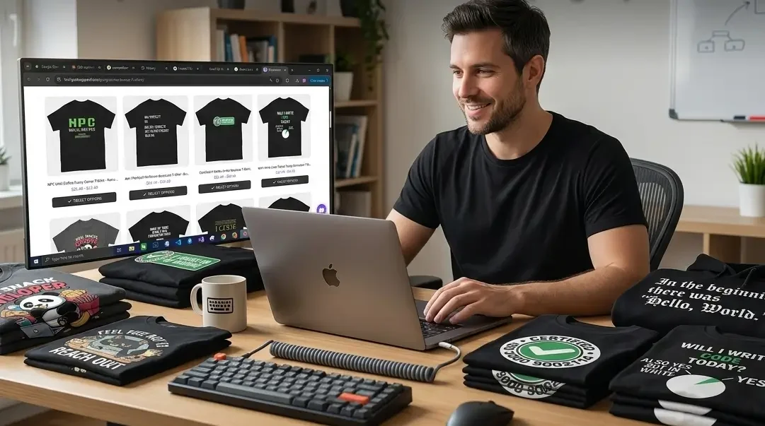
The fastest path to wearing great programmer shirts is to shop from brands that have already done the design work at a high level, specifically brands that come from inside developer culture and use DTG printing on quality cotton. TechGeeksApparel is the strongest option here, with a collection organized by tech discipline that covers many of the design categories above. Browse the funny coding shirts and geeky t-shirts collections as starting points.
For Print-on-Demand Creators
If you’re building a print-on-demand store or creating custom shirts, these concepts are starting points, not finished designs. The technical accuracy, visual treatment notes, and category organization in this post are the framework; the execution is the work. Focus on:
- Getting the code syntax exactly right before printing
- Choosing monospace fonts that accurately represent the language being referenced
- Testing designs with actual developers before committing to a production run
- Using platforms like Printful or Printify which integrate with major e-commerce platforms and offer DTG printing quality
For Custom and Gift Orders
For a personalized gift or a one-off custom shirt based on one of these concepts, platforms like CustomInk and Spreadshirt allow custom text and simple design uploads. For higher-quality one-off prints, local print shops with DTG capabilities are often the best option for small quantities.
For pre-designed developer shirts that are ready to order immediately, the complete developer apparel collection at TechGeeksApparel covers many of these design categories with finished, quality-controlled products across t-shirts, hoodies, sweatshirts, and accessories.
The Internal Linking to Complete Your Research
These 100+ concepts give you the inspiration, but the full picture of developer apparel goes deeper. For the best curated existing designs already on the market, see our guide to the 50+ best geeky t-shirts for programmers. For how to build complete developer outfits around your shirts, the geeky outfits guide for tech professionals covers everything from remote work to conference dressing. And for the comprehensive overview of the entire developer apparel and gift world, the ultimate guide to funny programmer t-shirts, developer gifts, and geeky apparel is your hub.
Conclusion: The Best Design Is the One That Makes a Developer Go “Yes. Exactly.”
Here’s what every design on this list has in common: it captures something true.
Not approximately true. Not adjacent to true. Actually, specifically, technically true about the experience of being a developer, writing code that breaks in ways it shouldn’t, debugging issues you caused yourself, deploying things you’re not entirely confident in, and somehow building software that people use despite all of the above.
The funniest programmer t-shirt designs aren’t the cleverest or the most visually complex. They’re the ones that make a developer look up from their laptop, read the shirt someone’s wearing, and immediately think: “Oh my god. That’s exactly what I was doing at 2 PM last Tuesday.”
That’s the target. These 100+ design ideas are the map. Go find the one that hits that moment for the developer in your life, or for yourself.
And if you want to skip the concept phase and go straight to a finished shirt that’s already been designed, printed, and worn by thousands of developers who felt exactly that, start at TechGeeksApparel.
Frequently Asked Questions (FAQs)
What are the best funny t-shirt design ideas for programmers in 2026?
The best funny t-shirt design ideas for programmers in 2026 fall into a few key categories: classic debugging and bug humor (“It’s Not a Bug, It’s a Feature”), deployment and DevOps designs (“Deploy on Friday,” git commit -m "Fixed everything"), programming language war concepts (JavaScript type coercion jokes, Java verbosity humor, Rust compiler references), CSS-specific frustration designs, and AI/LLM humor (“I Asked an AI to Fix My Code, Now I Have 47 New Problems”). The common thread is technical accuracy, the joke must be correct to land with developers. This full guide covers 100+ concepts with visual treatment notes for each.
What makes a programmer t-shirt design actually funny to developers?
Three things make a programmer t-shirt design genuinely funny to developers: technical accuracy (the code syntax or reference must be correct, developers will notice immediately if it’s wrong), shared experience (the joke should reference something every developer has actually lived through, not just understood abstractly), and specificity (designs targeted at a specific language, role, or experience connect more deeply than generic coding humor). Visual treatment matters too, monospace fonts for code references, the right color palette, and clean layout all contribute to whether the joke lands or falls flat.
Can I use these design ideas for a print-on-demand store?
These concepts are starting points and inspiration, not finished designs. If you’re building a print-on-demand store, you’ll need to develop each concept into an actual design with proper typography, accurate code syntax, and thoughtful visual treatment. Focus on technical accuracy above all else, as developers are the most detail-oriented audience in existence and will notice a missing semicolon or wrong syntax immediately. Platforms like Printful and Printify are good starting points for print-on-demand production with DTG quality.
What visual style works best for programmer t-shirt designs?
The most effective visual styles for programmer t-shirts are: pure typographic treatments in monospace fonts for code-based jokes (they read as authentic and technically credible), code block aesthetics with dark backgrounds and syntax-appropriate colors, diagram or flowchart formats for process-based humor, and certificate or badge formats for achievement-based jokes. The key principle is using the visual language of coding itself as a design system, when a t-shirt looks like something a developer would actually see on their screen, the humor feels earned rather than imposed from outside the culture.
Where can I buy programmer t-shirts with designs like these already made?
TechGeeksApparel is the strongest source for ready-made programmer shirts that match the design quality and technical accuracy described in this guide. Their collection is organized by tech discipline, coding humor, web development, cybersecurity, data science, and more, with DTG printing on 100% cotton and unisex sizing from S to 5XL. For community-created designs in very specific niches, Redbubble is a useful secondary source. For limited-edition curated designs, Cotton Bureau is worth checking periodically.